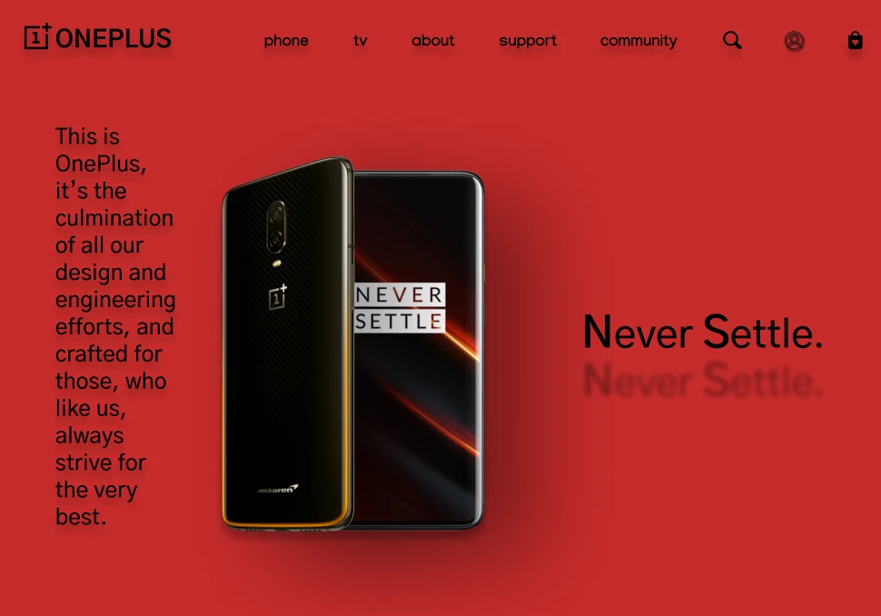
OnePlus india_Home page Redesign
Category:
Web Design, Self Learning Project
Client:
Self
The Challenge
The challenge was clear: revamp OnePlus India's homepage to reflect its branding and design principles while enhancing the user experience.
Limitation of the live website homepage
1. Inconsistent image overlays cause longer load times and wasted bandwidth.
2. The mobile version lacked responsiveness.
3. Cluttered homepage with redundant content is challenging for screen readers.
My Approach
Defining A Design System: I created a comprehensive style guide for consistent design elements and branding across the website.
Revamped Home Page
· Aligned with modern design principles: minimalistic, clean, and user-friendly.
· Focus on brand colour, negative space, easy navigation, and a clear content hierarchy.
· Four-page view concept for readability and scannability.
· Clean navigation, descriptive UI, and streamlined content for improved user engagement.
Highlights
· Created a design system to lay the foundations first.
· Redesigned header aligned with OnePlus branding.
· Simplified store section for easy navigation.
· Decluttered footer with essential information.
Check out the links for mock-ups to get a glimpse of the revamped homepage's design.